
Sage Matcha
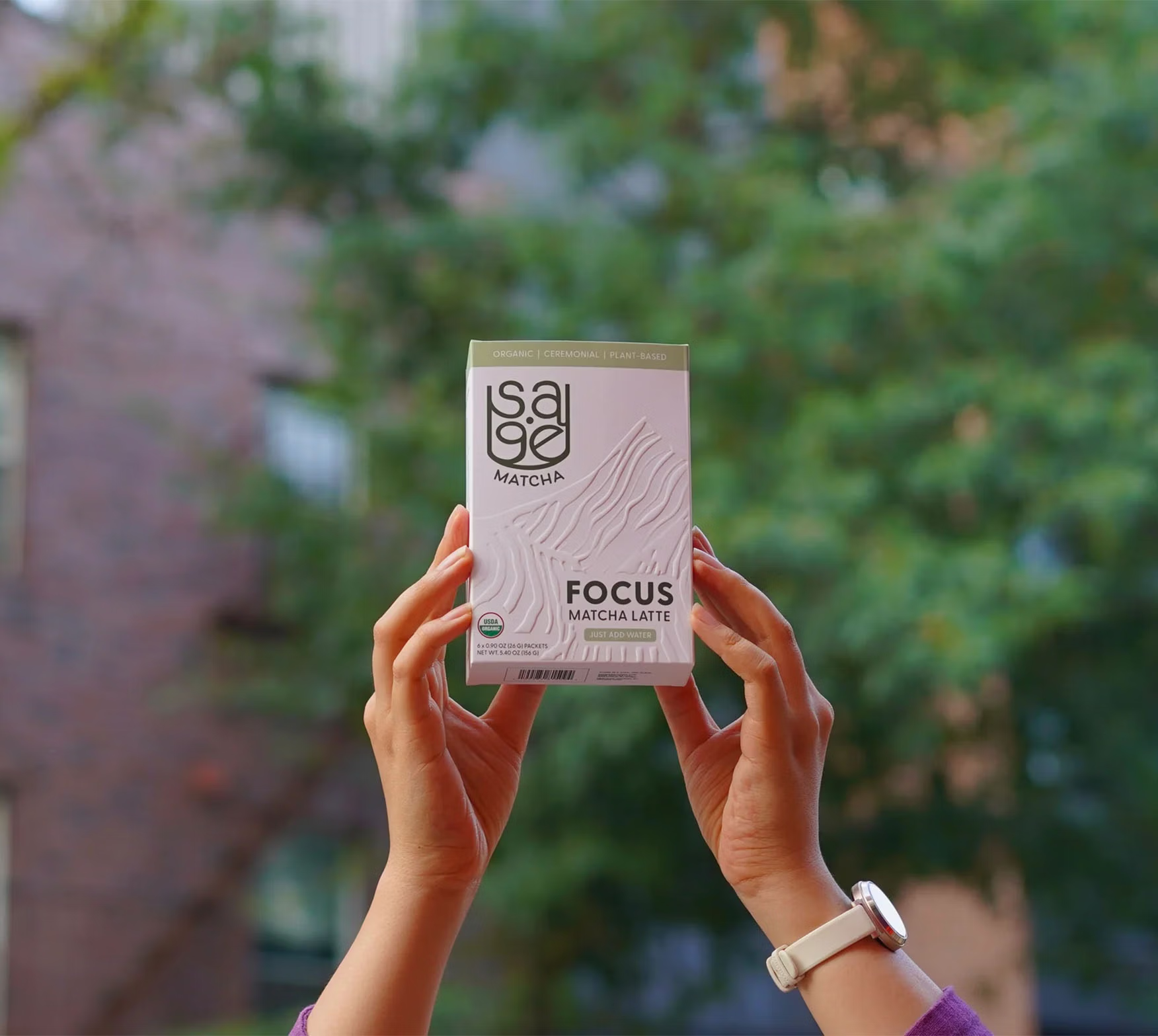
“Ancient wisdom made modern.” As a matcha enthusiast, Larry wanted to modernize traditional tea ceremonies by making it more convenient for busy lives to integrate the health benefits of matcha into their daily routines, promoting clearer focus and overall well-being.
The process
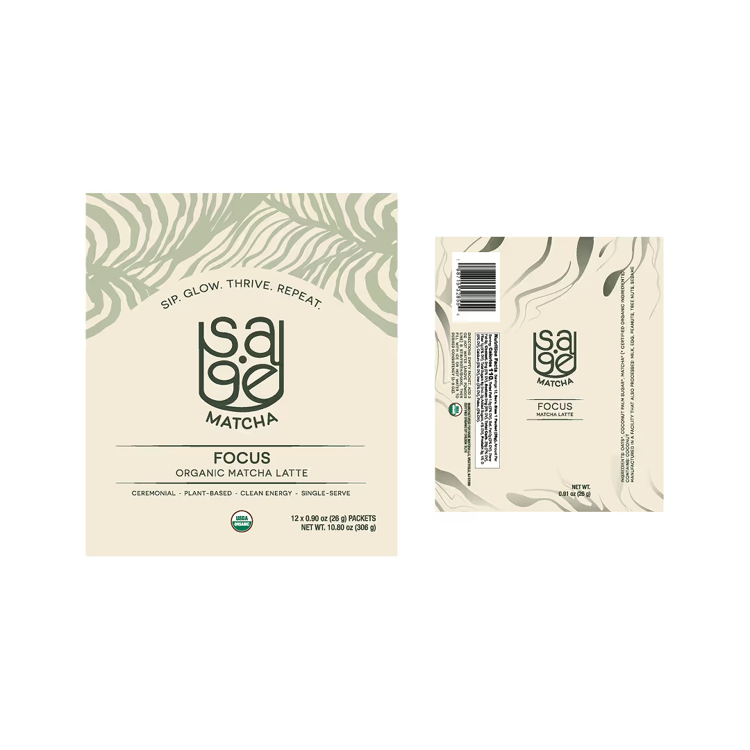
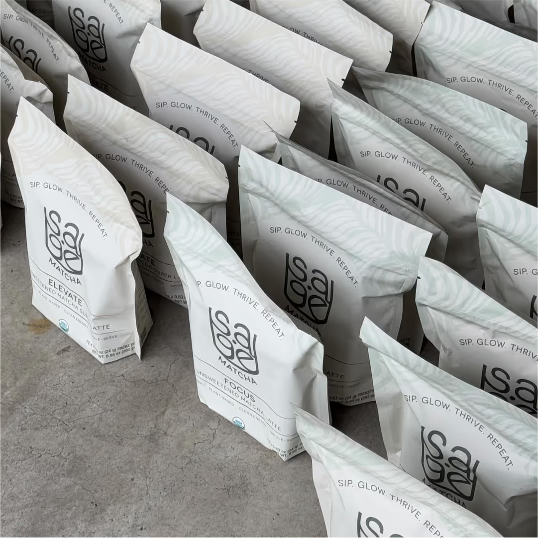
Our first wave of production
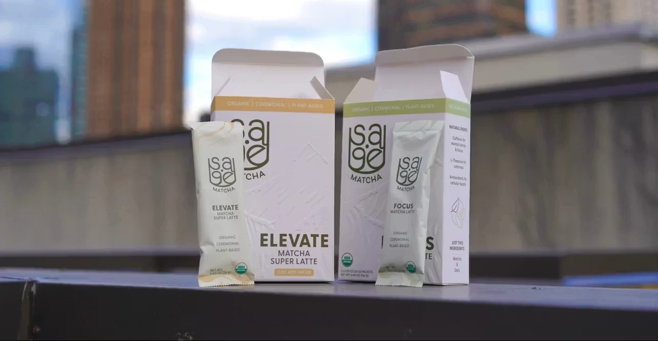
Knowing that a branding guide and logo had already been established for Sage Matcha, our primary goal was to create trendy, earthy packaging that would complement the single-serve sachet and pouch templates that we’d be utilizing for the first round of production. After exploring options with the original green/gold colorway, we ended up using the light cream from the color palette as the main color swatch to provide a stronger contrast for the product’s copy.
A fresh, new look
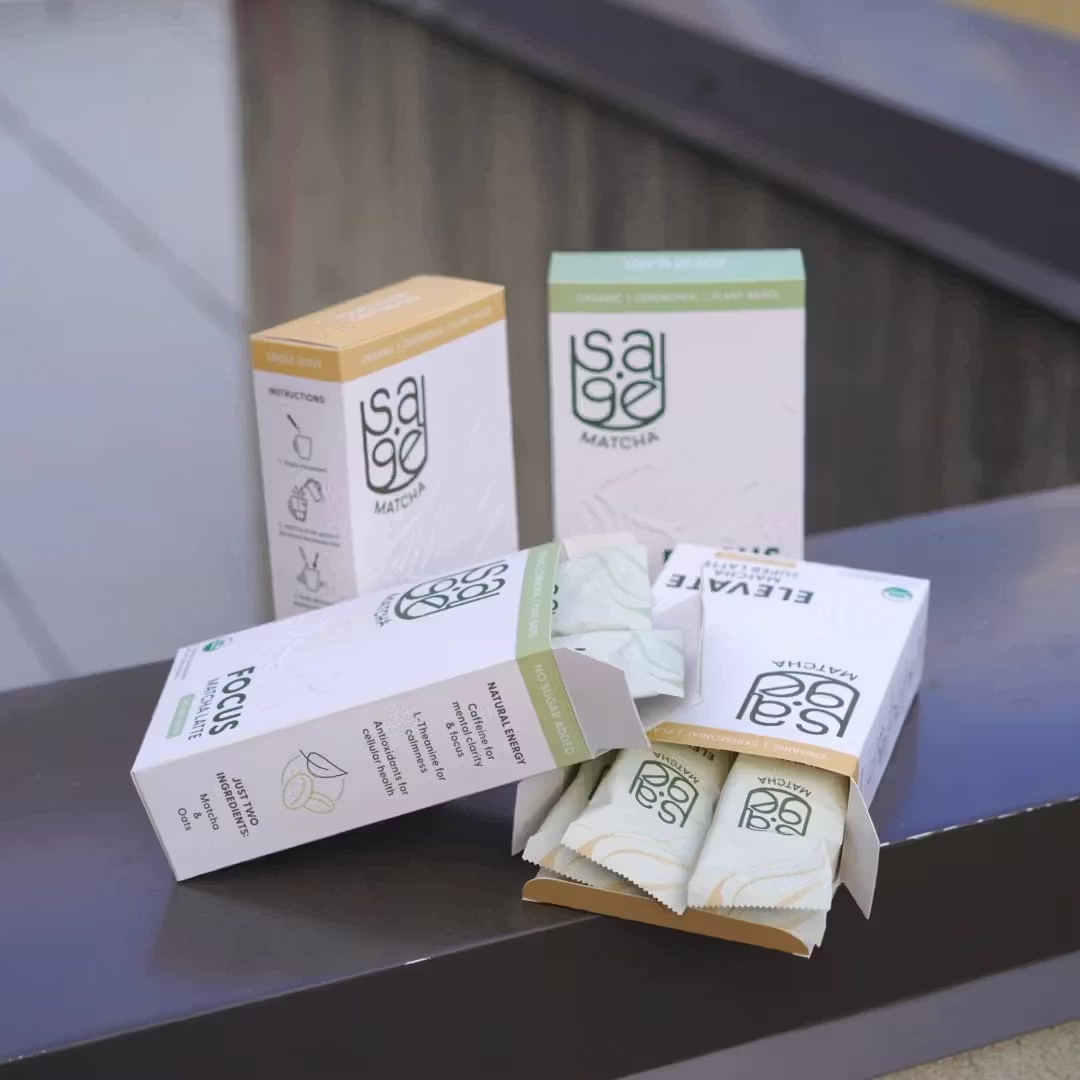
After a successful December 2024 launch that included pop-up events like the Holiday Ouri Market and NYC’s Pop-Up Grocer, it was already time to think about re-orders. With two of the four blends being discontinued and a renewed focus on brick-and-mortar locations (instead of e-commerce), Larry asked if I’d be willing to jump back in to update the existing pouches to a box format. (And of course, I said yes!)
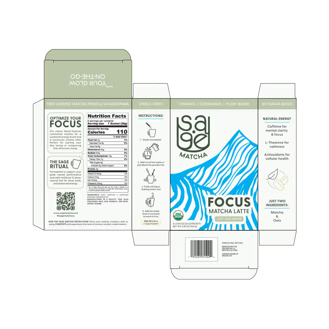
Finalizing the templates
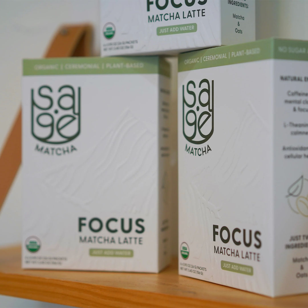
During the development process, Larry mentioned that one of my initial sketches for the pouches still stood out to him months later. This ultimately resulted in the asymmetrical layout and embossed elements of our new packaging, refreshing our previous design with an upscale, clean look. Using the technical guidelines provided by Larry’s co-packer, I built out the final files for the box and sachet templates.
To the shelves!
From the iconic Macy’s in Herald Square to the West Coast, Sage Matcha’s popularity is continuing to grow through word-of-mouth - true to the brand’s organic roots! Our packaging design contributes to this by not only capturing customers’ attention on the shelves, but also encouraging further brand engagement through social media stories and posts.



Client testimonial
[Erika's] creativity, flexibility, and attention to detail were invaluable throughout the process, and I especially appreciated the vision boards and regular updates she provided. Her willingness to adapt to my changing schedule and incorporate feedback from my manufacturer was essential to the success of the project, as we worked side-by-side with live updates from the operations-side of things. Most importantly, Erika took in my initial vision and helped me create packaging that was even more unique and impactful than I had originally imagined.”

