
Gerber Lil’ Biscuits (Unofficial Redesign)

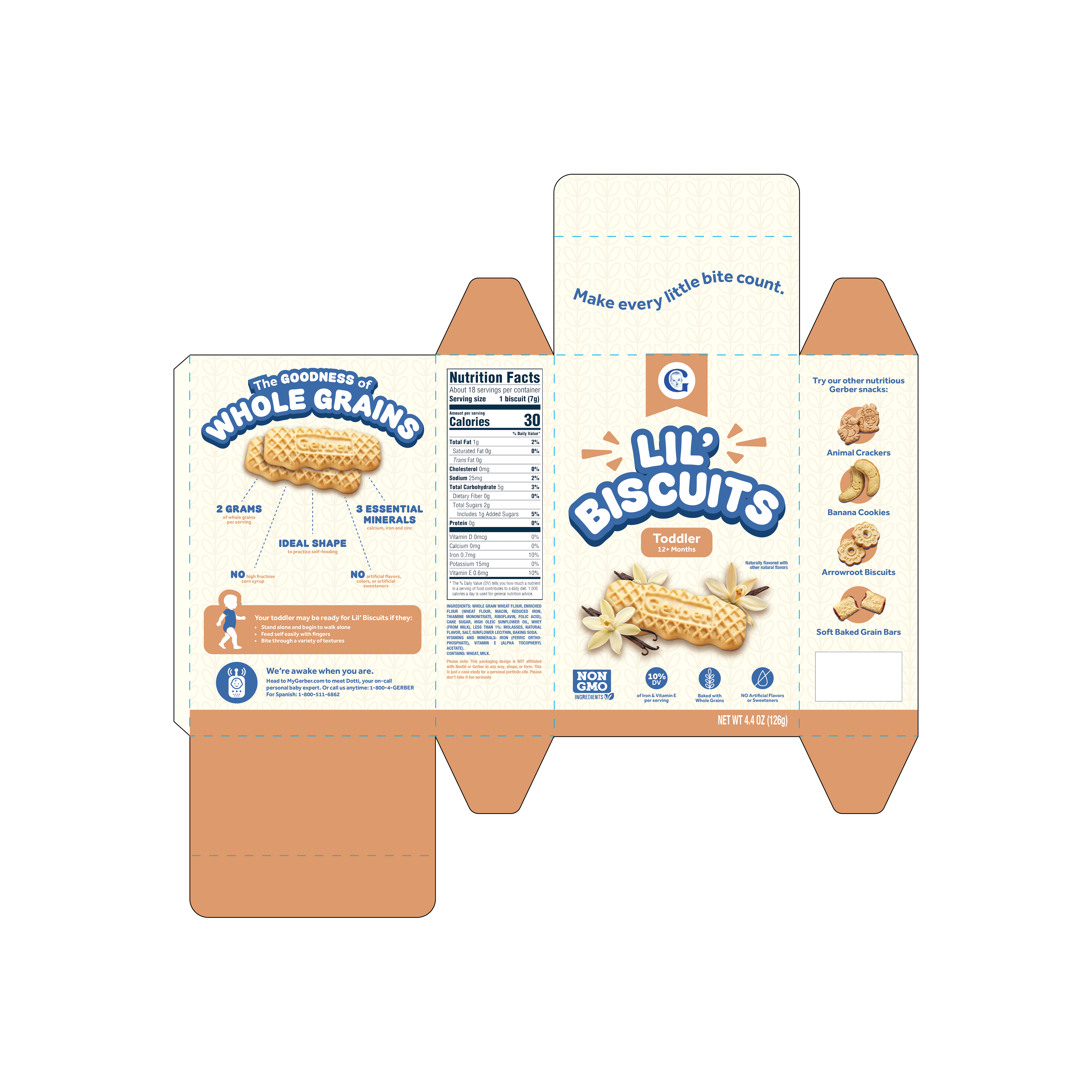
In this self-initiated project, I redesigned Gerber’s existing packaging for Lil’ Biscuits to address previous customer concerns, revisit the hierarchy of information, and explore existing trends within kids’ CPG while still staying in-line with Gerber’s current branding.
Please note: This is a conceptual project created for personal purposes only. I am not affiliated with Gerber or Nestlé.
The process
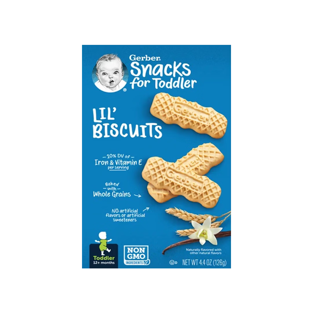
Areas of Improvement
I originally started this project back in 2025, when the “old” Lil’ Biscuits packaging was still in circulation. Personally, I felt like the font wasn’t the most legible and the packaging copy (especially on the front panel) lacked hierarchy. Most importantly, I noticed that customers were leaving reviews about this snack being a choking hazard for babies younger than 12+ months old, prompting the need to call out the “toddler” age recommendation more prominently on the packaging.
Early Development
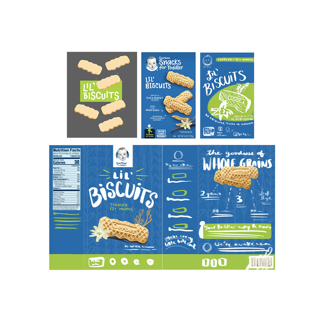
To start, I pulled a few color swatches from the previous Lil’ Biscuits design and chose a “fun” font with varying baseline shifts. I applied the lime green swatch more liberally to visually emphasize the toddler age grade, as this would allow for easier identification from a customer’s perspective. While I was planning on replacing the existing photography with vector illustrations, I realized that keeping the photography would likely give parents more confidence in what they’re purchasing for their kid(s), so I left it as-is.
Revisiting the Color Palette
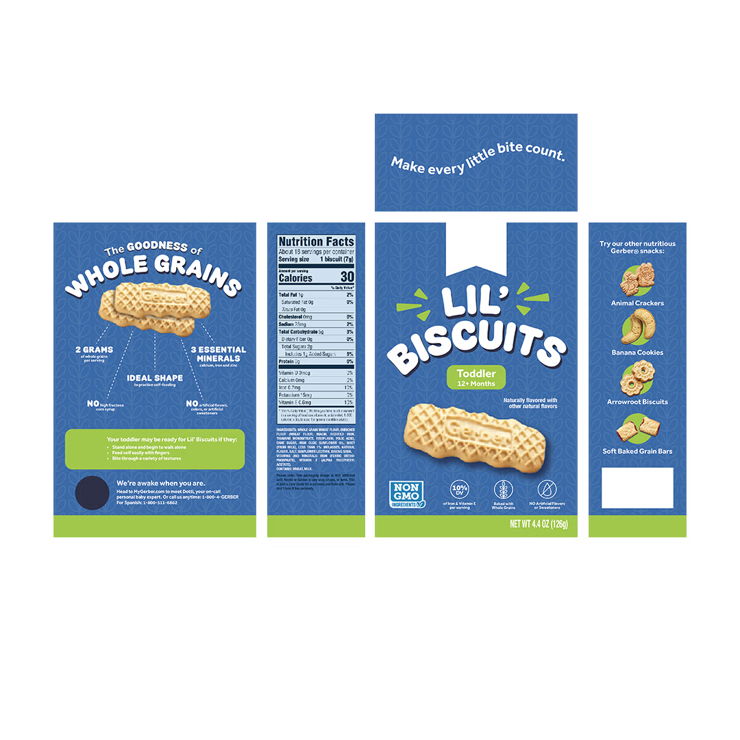
After some time away from this project, something about my design simply started to feel off. I shopped my in-progress design around for feedback, when finally, my friend Delilah hit the nail on the head - “The color palette reminds me of dog food more than baby food.” (AGH, SHE NAILED IT!) After researching current color palette trends for baby/toddler products, I settled on a neutral cream background with a tonal grain pattern that I had developed earlier on. Additionally, I traded the lime green for a muted orange to designate the toddler age grade and used blue to complement the existing Gerber branding.
Mock-Ups
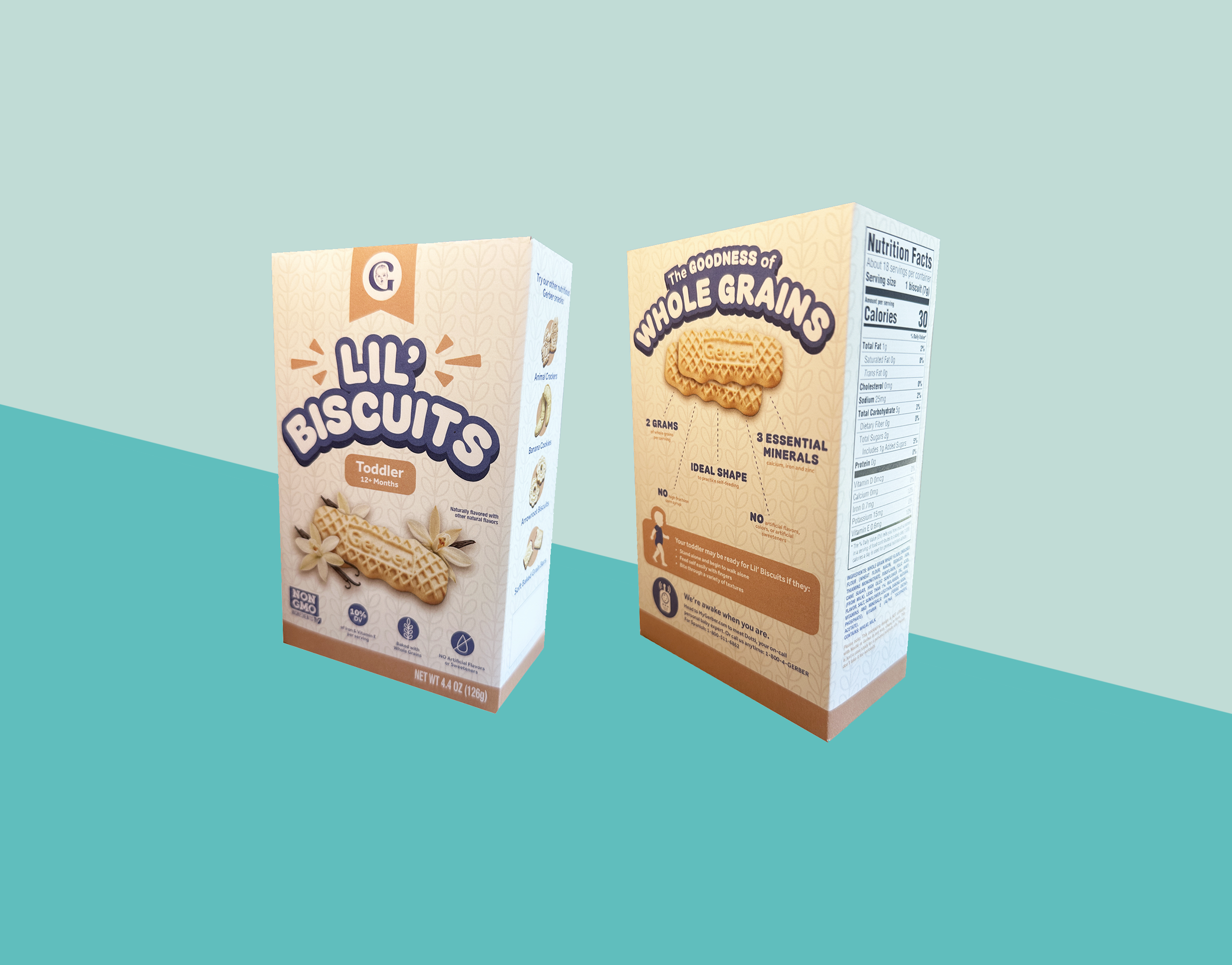
After getting the final stamp of approval (from myself, LOL!), I printed out my box template onto cardstock and mocked it up with the actual Lil’ Biscuits. I feel like my redesign not only resolves customers’ concerns, but also complements the product itself and helps the packaging feel more kid-friendly without losing the integrity of the Gerber brand. (And did I get to snack on a couple of Lil’ Biscuits after my photo shoot? Absolutely. They’re the best.)



Client testimonial
